O Liberal: a daily read, now optimized for everyday life on the Internet.

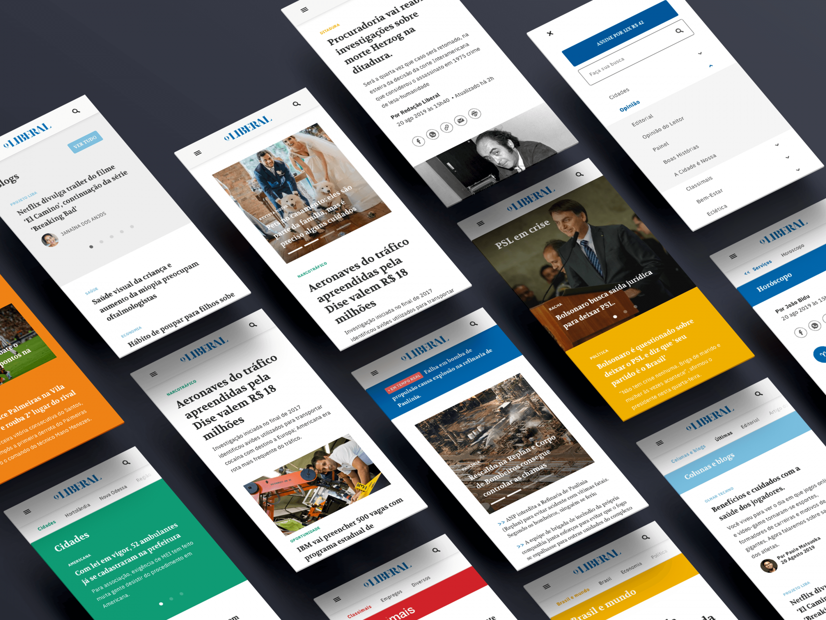
It was in 2016 that the leading news paper in Americana and the Textile Hub region was last updated. Since then, it has performed well, but has remained untouched while the internet, as always, has kept moving. User behavior has evolved. So, once again, we immersed ourselves in the O Liberal universe, understanding the pains, needs and desires so that we could lead an overhaul of the site.
We provide a WordPress structure and design that is completely modular and customizable, editor-friendly, newsroom-friendly and reader-optimized. All this, not only to maintain the rising numbers of the previous version of the site (made by us too) such as quadrupling the number of sessions and doubling the number of views, but to reach new readers looking for news about the region, Brazil and the world and make the new website the Liberal of their daily reading.
WHAT WE DID:
- Grid revision and componentization
- UI redesign
- Back-end performance
- Smart WordPress
Special features
of the project
01. Constantly updated content
02. A site that's friendly to your mobile internet plan
03. Design for monetization

01. Constantly updated content: focus on now.
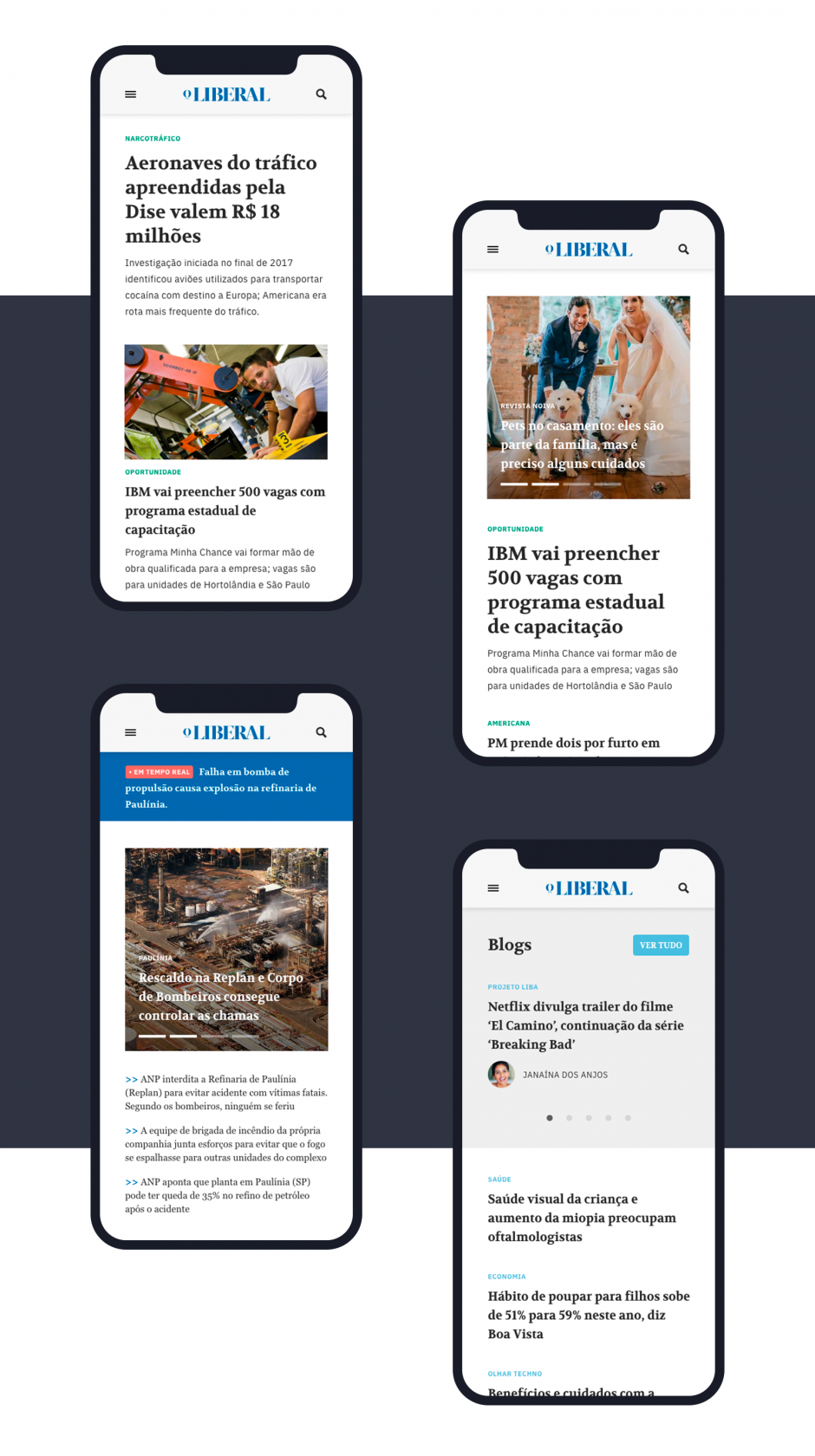
Most regional news sites lead readers to irrelevant stories. We prioritize the local news with the highest demand while optimizing the state, national and world news feed. A better sectioned and grouped home page, optimizing the user's induction and understanding of the published news and its timeline.
Speaking of the timeline, we also redesigned the way urgent news and its coverage are displayed, creating levels of signposting according to the time of publication and updates.
Bonus: we also managed to get more news on the home page while respecting aesthetic criteria and visual comfort for readers. In short, O Liberal's new website is designed to be included in users' browser bookmarks and be the first thing they read every day.
02. A
friendly website for your data plan: AMP
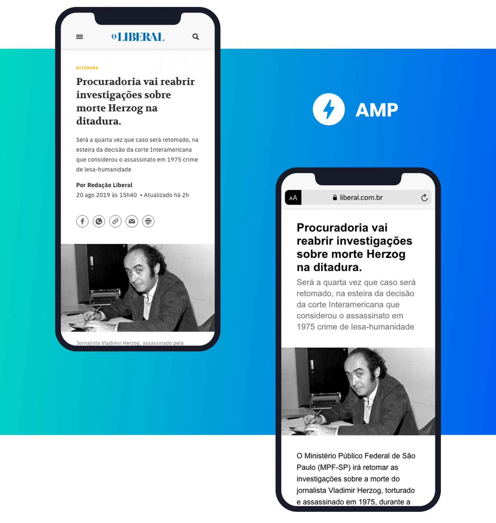
With the growing number of mobile readers, we rethought the purpose of the site, opting for a design and back-end intensively optimized for AMP. AMP stands for Accelerated Mobile Pages, which are website pages optimized for simplified and almost instantaneous loading when accessed via mobile devices.

As an example in the image above, when searching on Google using a cell phone, pages with AMP configured are marked with its acronym. When you click on a result marked as AMP, the simplified version of the page loads almost instantly.
03. Cost-effective design
This project for the new design and componentization of the site allowed us to reconstruct the grid in such a way as to integrate the content and advertising in a symmetrical way, making reading more subtle and pleasant.
This, following the visibility metrics necessary for the site to achieve its profitability targets without compromising its product and main focus, which is to attract new readers.
Want to understand the project better?
Go to www.liberal.com.br


